Rebranding and rebuilding a design system for creatives
I joined Envato Elements to completely redesign the interface and design system. We re-branded to speak the language of our creative audience while placing our content at the center, and massively reduced design and tech debt.
Lead Product Designer
|
2023 - 2024
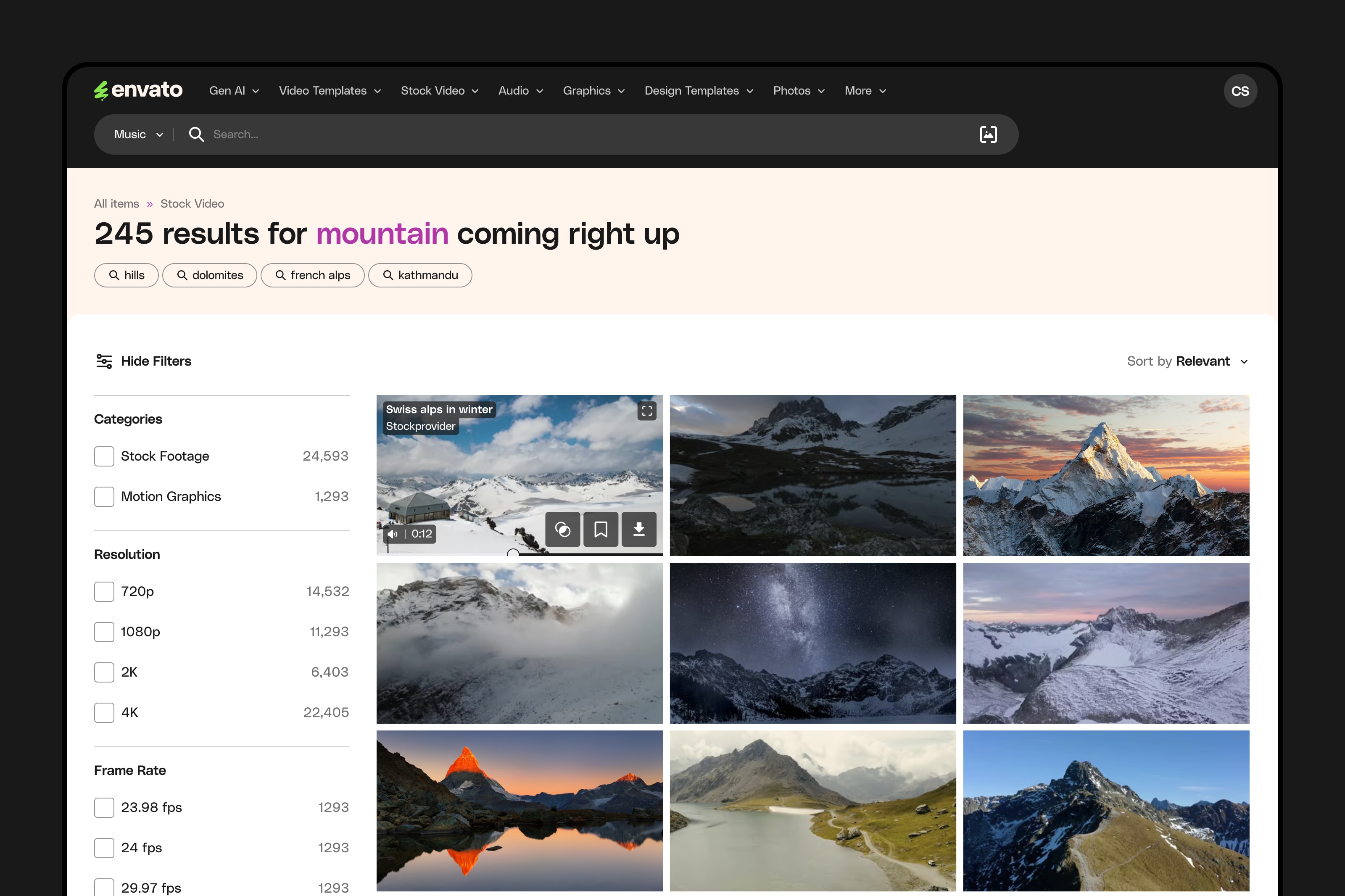
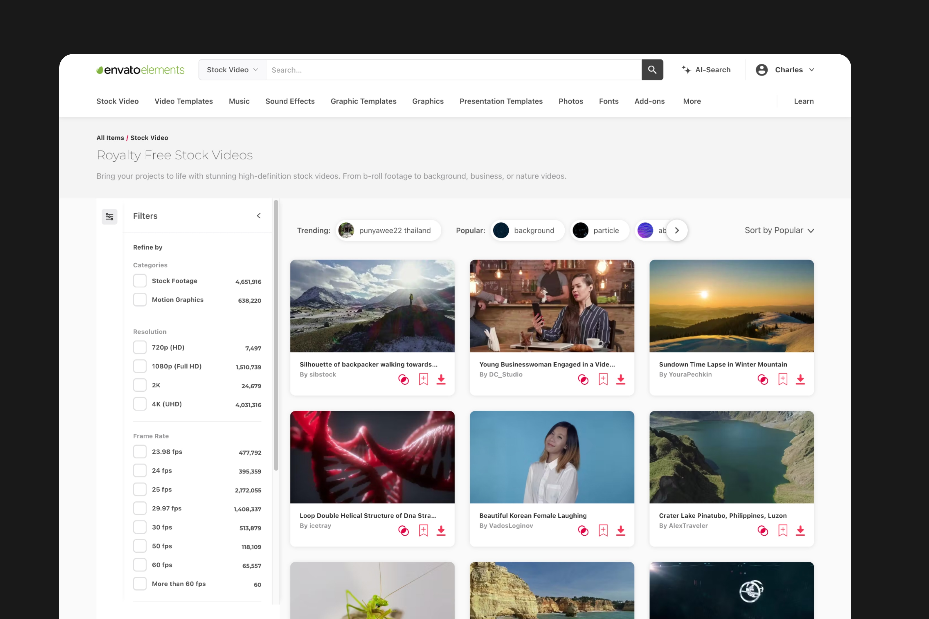
Stock video results page and filter.
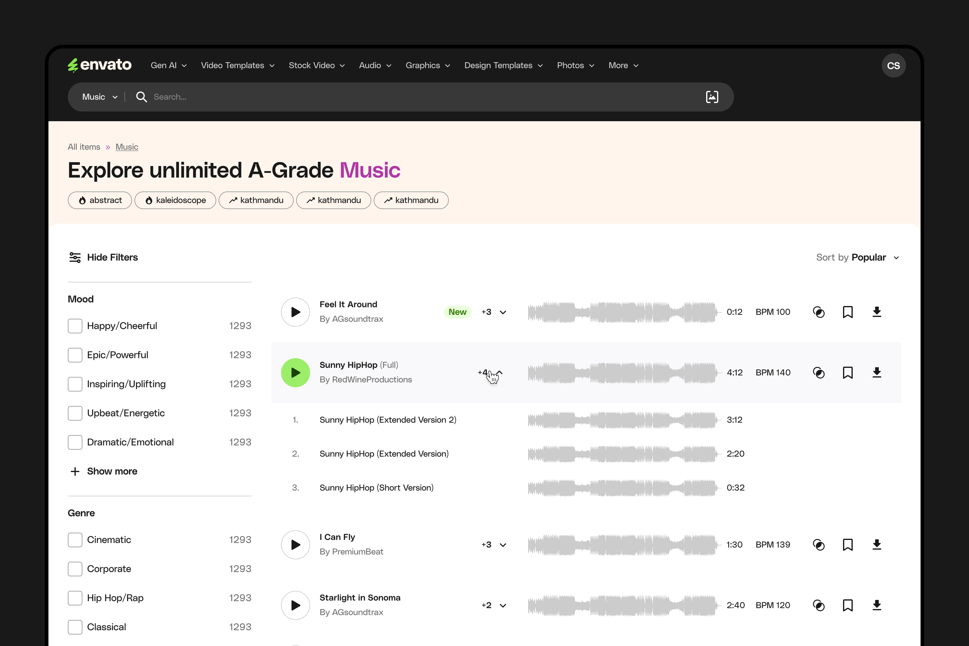
Music results page and filter.
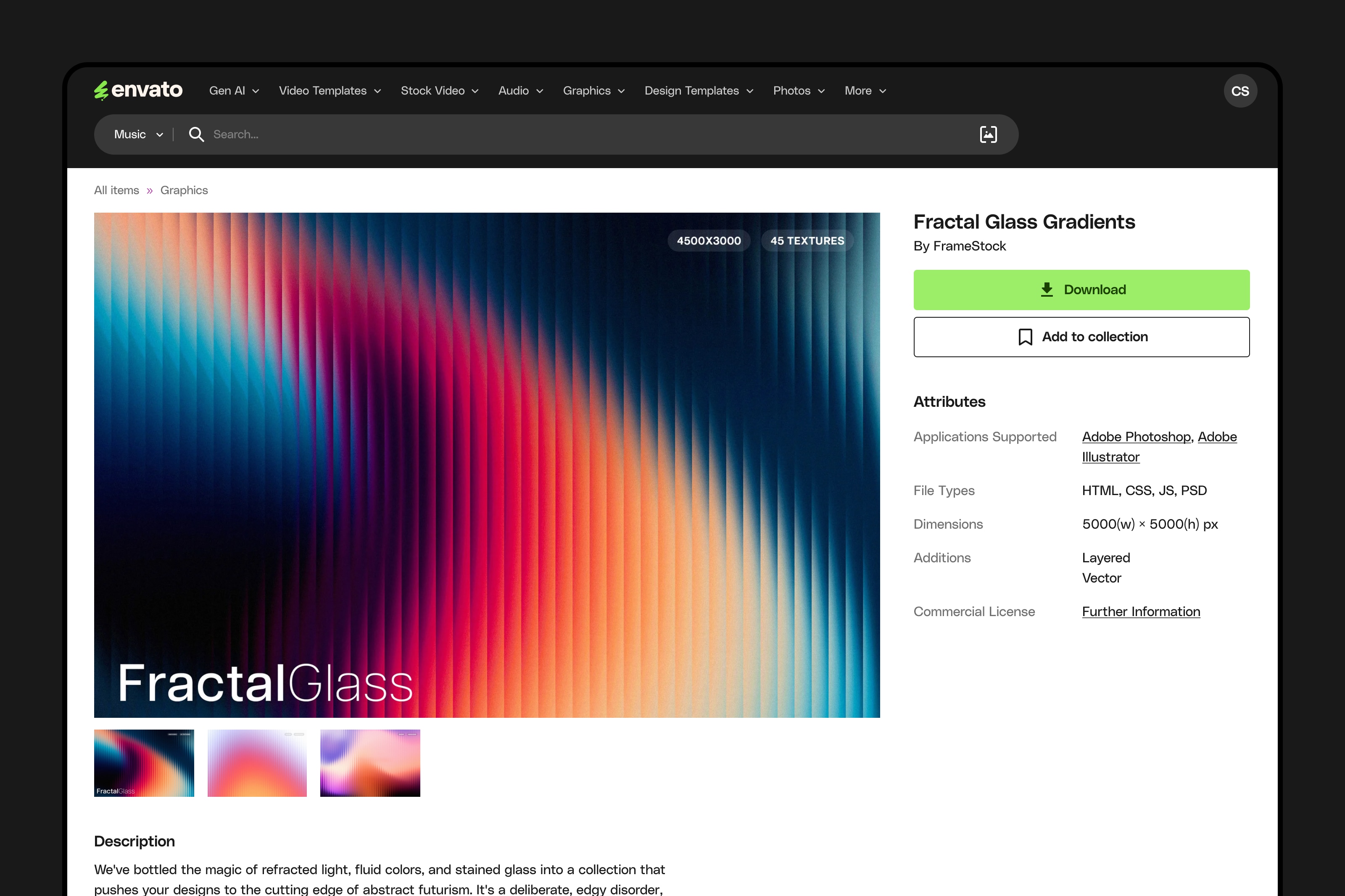
Item detail page.
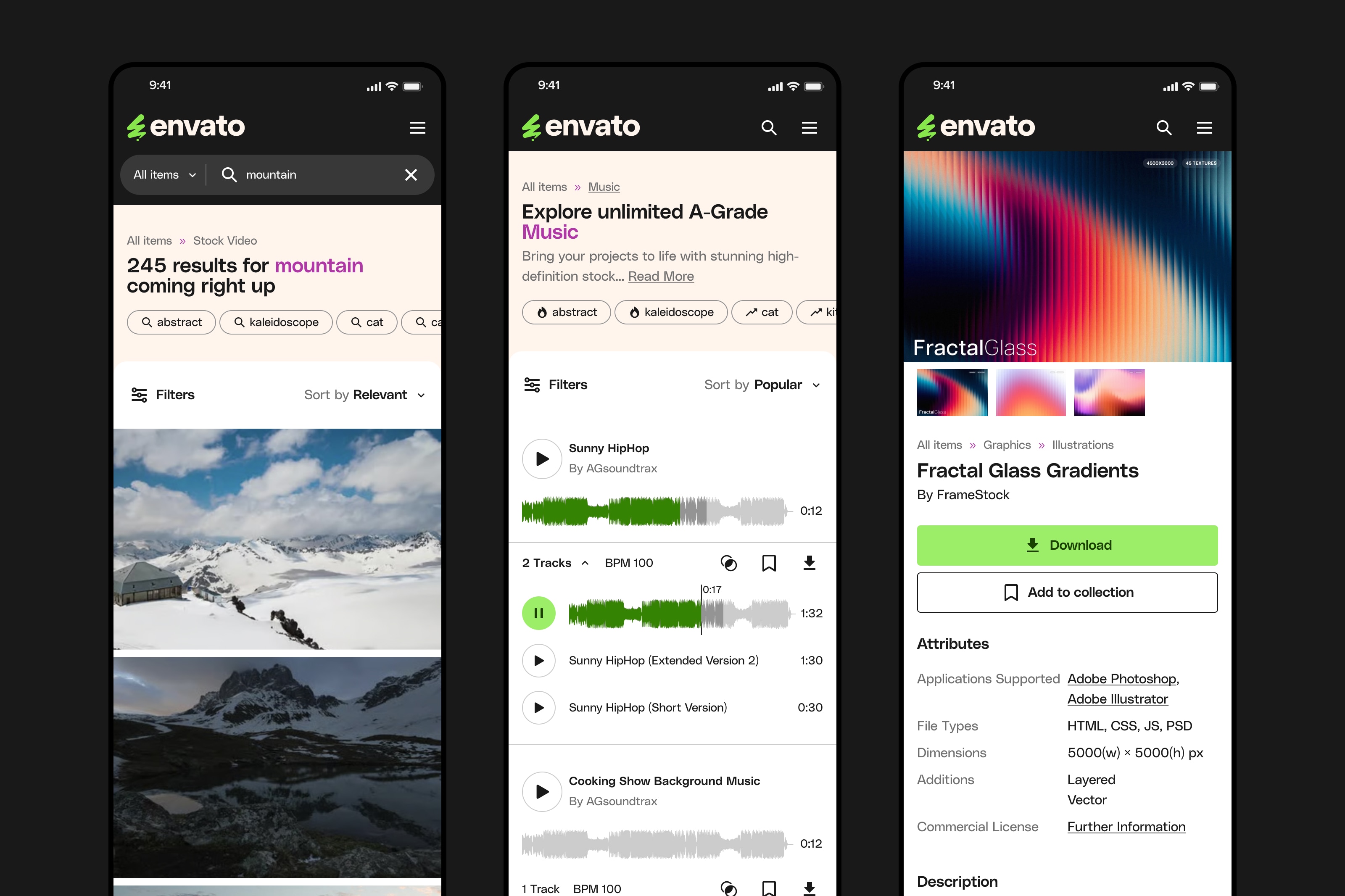
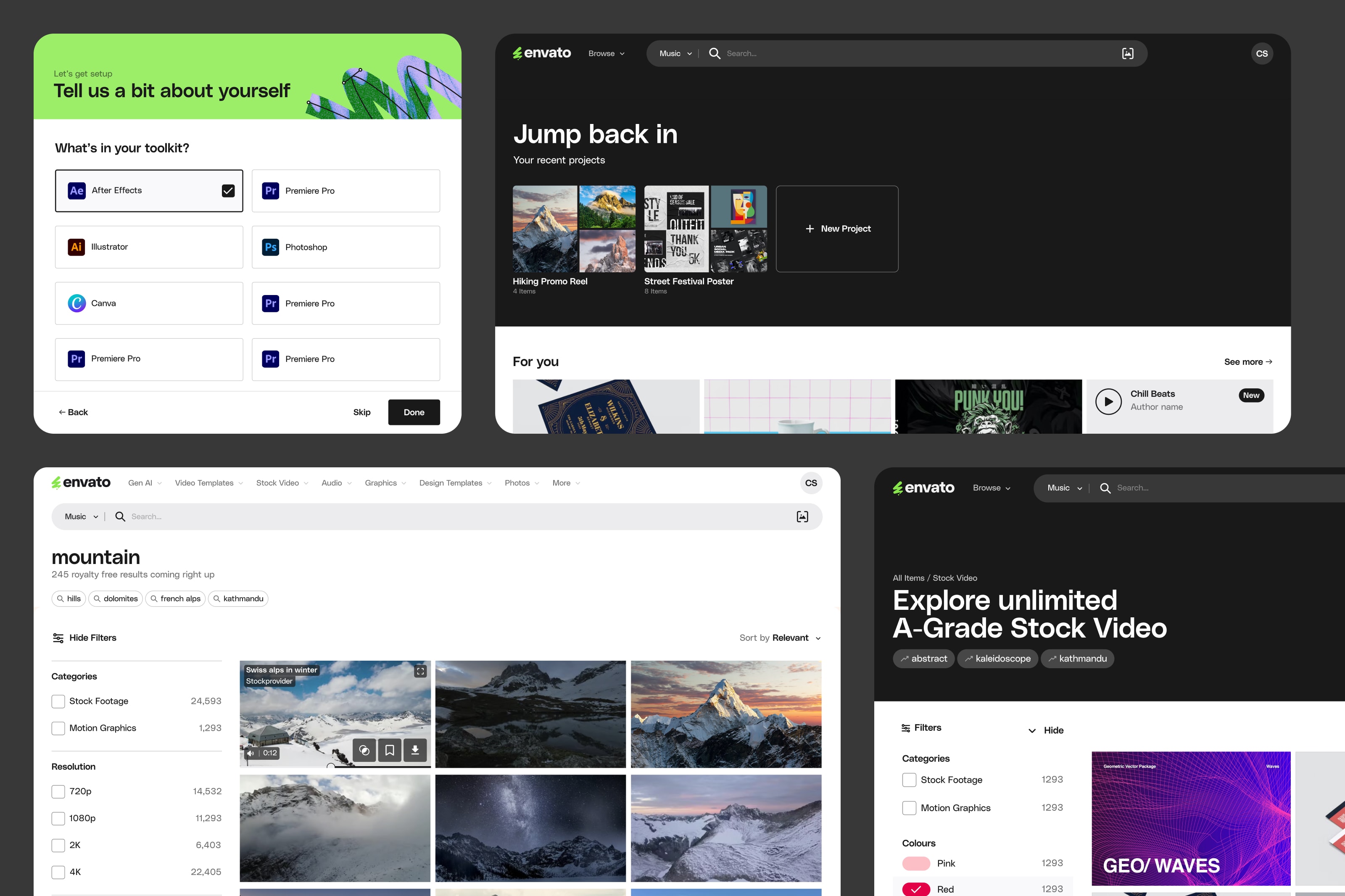
Mobile versions of video, music, item detail.

Range of modals for core flows.

Pricing page.
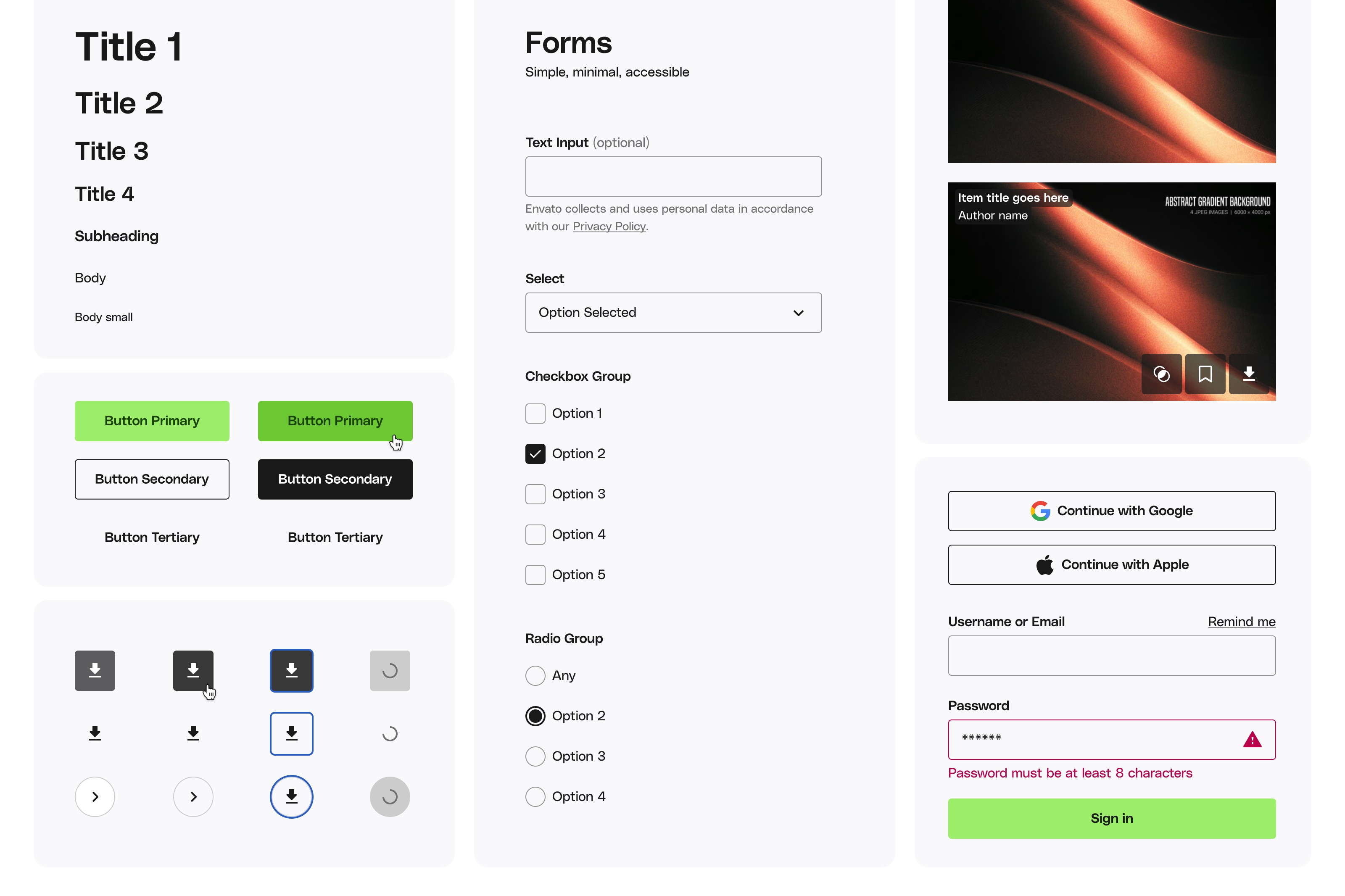
Selection of core design system styles and components.
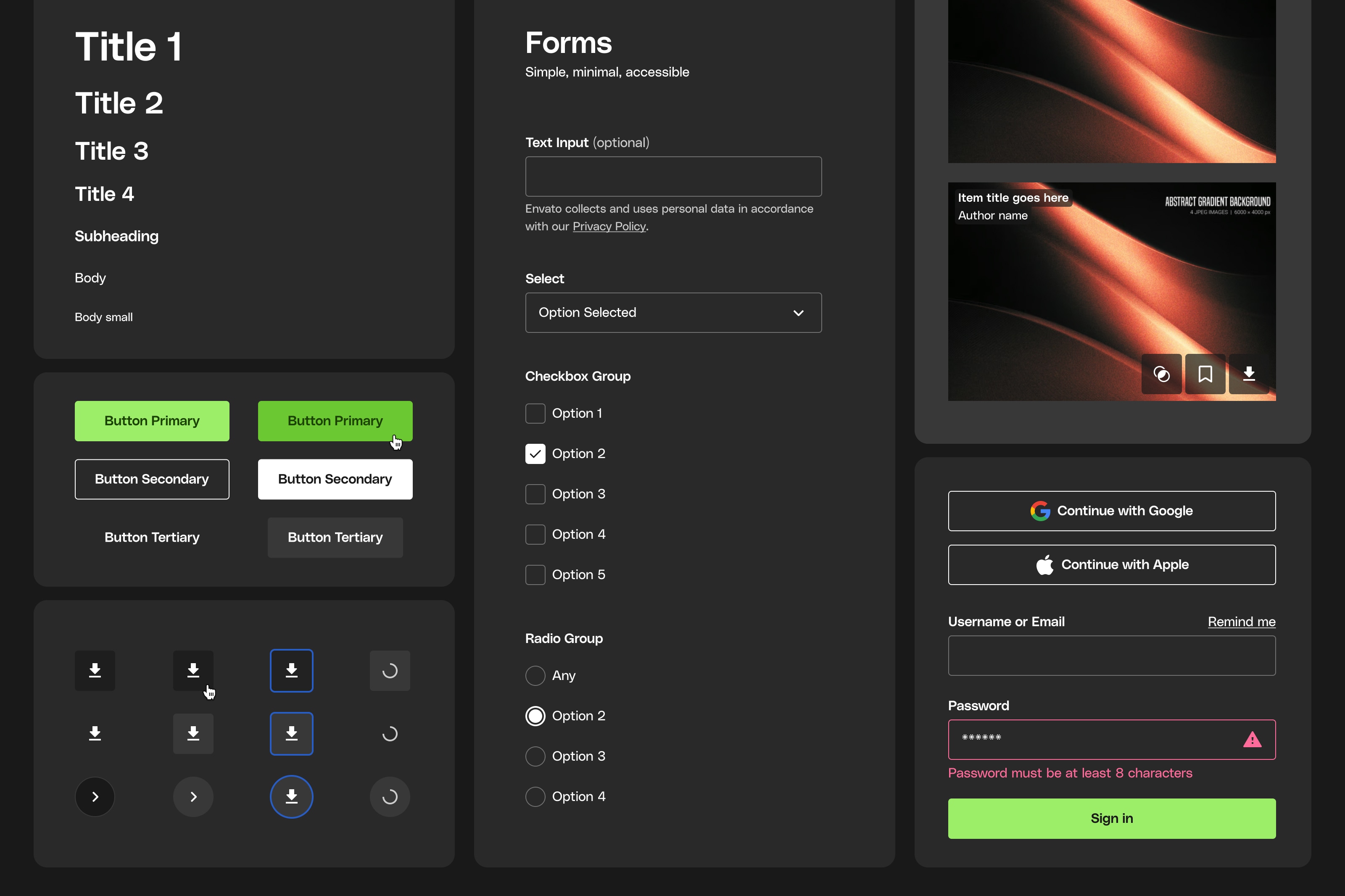
Design system dark mode variations.
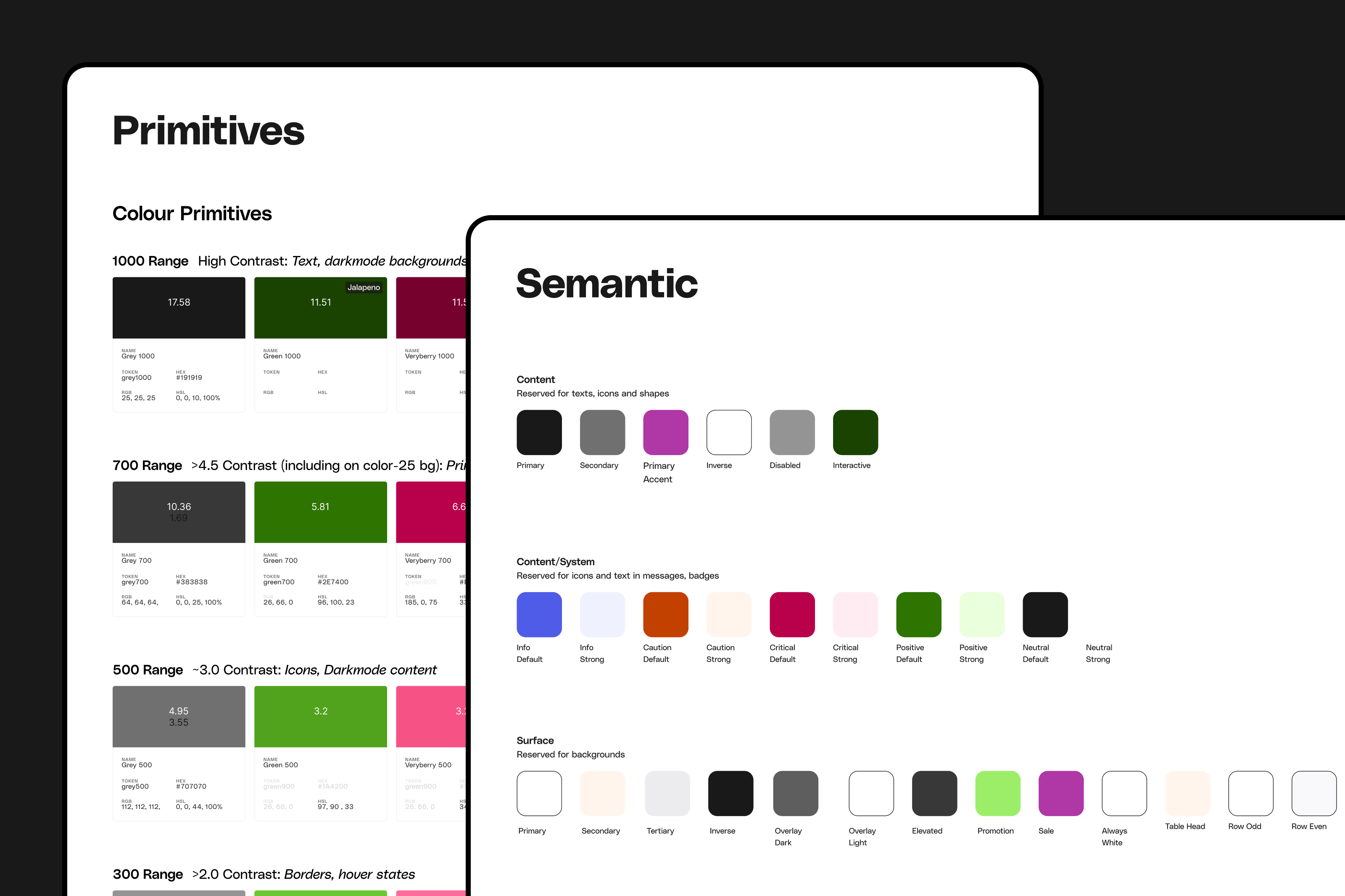
Color system.